Matplotlib
Google drive folder with Jupyter Notebooks used in class: Jupyter Notebooks from class
The matplotlib library is probably the single most used Python package for
2D-graphics. It provides both a quick way to visualize data from Python, and create
publication-quality figures in many formats. We are going to explore Matplotlib
in interactive mode covering most common cases. We will also look at the object
oriented interface which provides more control and flexibility over the generated
figures.
An extensive gallery of examples using Matplotlib can found at the Matplotlib examples page.
See also a summary of pyplot commands.
Some useful plotting options can also found in the SciPy lecture notes.
IPython
IPython is an enhanced interactive Python shell that has lots of interesting
features including named inputs and outputs, access to shell commands, improved
debugging and much more. When we start it with the command line argument --pylab,
it allows interactive Matplotlib sessions that has Matlab/Mathematica-like
functionality.
Matplotlib and pyplot
There are nice tools for making plots of 1d and 2d data (curves, contour
plots, etc.) in the pyplot sub-module of Matplotlib.
To see some of what’s possible (and learn how to do it), visit the Matplotlib gallery. Clicking on a figure displays the Python code needed to create it.
The best way to get Matplotlib working interactively in a standard Python shell is to do
>>> import numpy as np
>>> import matplotlib.pyplot as plt
>>> plt.interactive(True)
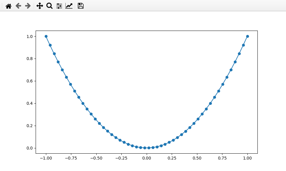
>>> x = np.linspace(-1, 1, 50)
>>> plt.plot(x, x**2, 'o-')
Notice also that, since pylab includes both matplotlib and numpy,
you can get the exact same features using a more compact way as follows
>>> import pylab
>>> pylab.interactive(True)
Then you should be able to do
>>> x = pylab.linspace(-1, 1, 50)
>>> pylab.plot(x, x**2, 'o-')
and see a plot of a parabola appear.
A simple plot of \(y = x^2\).
You should also be able to use the buttons on the window to interact with the plot, e.g. zoom in and out, change white space, change axis types, etc.
Alternatively, you could do
>>> from pylab import *
>>> interactive(True)
With this approach you don’t need to start every pylab function name with pylab, e.g.
>>> x = linspace(-1, 1, 50)
>>> plot(x, x**2, 'o-')
In these notes we’ll generally use module names just so it’s clear where things come from.
If you use the IPython shell instead, you can do
$ ipython --pylab

In [1]: x = linspace(-1, 1, 50)
In [2]: plot(x, x**2, 'o-')
The --pylab flag causes everything to be imported from pylab and set up for
interactive plotting.
Matplotlib and Jupyter Notebooks
If you prefer to use Jupyter Notebooks you can get a more Matlab-like environment. In a cell of the Jupyter Notebook, type;
%matplotlib inline
import numpy as np
import matplotlib.pyplot as plt
And on the next cell,
x = np.linspace(-1, 1, 50)
plt.plot(x, x**2, 'o-')
When you execute the cell above, (by hitting ctrl+enter) you can see a figure
as an output.
Labels, titles, grids, legends
Let’s continue with the plot of the parabola. Note that because we used
plt.interactive(True) we can enter subsequent commands while the plot
is already open.
First, add some axis labels and a plot title:
>>> plt.xlabel('x')
>>> plt.ylabel('y')
>>> plt.title(r'$y=x^2$')
Note
To use LaTex notation in Matplotlib plots you’ll need to use raw
strings prefixed by an r as in the previous commands. Math
mode can then be used safely by wrapping text with dollar signs.
This is particularly needed when including Greek text or other
items that would otherwise appear as escape codes. For example
>>> plt.xlabel(r'$\alpha$')
>>> # versus
>>> plt.xlabel('$\alpha$')
Those axis labels and the title are quite small. The xlabel, ylabel,
and title functions can take in keyword arguments to control the text properties.
Let’s change the axis labels to make everything larger:
>>> plt.xlabel(r'$x$',fontsize=16)
>>> plt.ylabel(r'$y$',fontsize=16)
>>> plt.title(r'$y=x^2$',fontsize=18)
Grid lines are often helpful to guide the viewer’s eye. These can be applied to major ticks, minor ticks, or both, and to the x-axis, y-axis, or both axes. For example
>>> plt.grid(which='both',axis='both')
After applying these changes you should have the following figure:
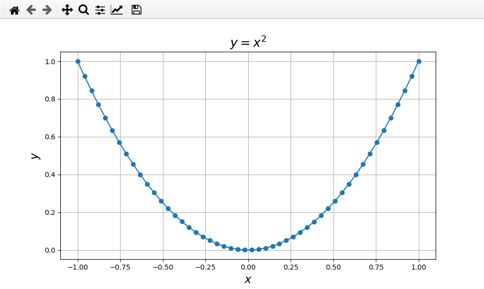
A simple plot of \(y = x^2\) with some nicer formatting.
Plotting multiple lines
We now consider an example of plotting more than one function in the same figure. In the script below, we’ve instantiated (and commented) all the figure settings that influence the appearance of the plot.
 1"""
 2/lectureNote/chapters/chapt05/codes/plot_sin_cos.py
 3The original code is from
 4http://www.scipy-lectures.org/intro/matplotlib/matplotlib.html
 5"""
 6
 7# Slightly modified: Ian May Fall 2020, and again 2021
 8
 9import numpy as np
10import matplotlib.pyplot as plt
11
12# Interactive defaults to False, we'll leave it that way
13# Uncomment the following to change that
14#plt.interactive(True)
15
16# Instead of passing fontsize arguments all the time we can set them globally
17plt.rc('axes',titlesize=14)
18plt.rc('axes',labelsize=12)
19plt.rc('xtick',labelsize=10)
20plt.rc('ytick',labelsize=10)
21plt.rc('legend',fontsize=8)
22
23# Create a figure of size 8x6 inches, 200 dots per inch (the default is 100 dots/inch)
24plt.figure(figsize=(8, 6), dpi=200)
25
26# Set up a grid and some functions to plot
27X = np.linspace(-np.pi, np.pi, 50)
28C, S = np.cos(X), np.sin(X)
29
30# Plot cosine with a blue continuous line of width 3.0 (pixels)
31# Note that plot commands apply to the axis object
32plt.plot(X, C, color="blue", linewidth=3.0, linestyle="-.")
33
34# Plot sine with a green continuous line of width 2.5 and diamonds as markers
35# compare format string '-gd' with individual keywords from previous call
36plt.plot(X, S, '-gd', linewidth=2.5, markersize=5)
37
38# Set axis labels
39plt.xlabel(r'$x$')
40plt.ylabel(r'$y$')
41
42# Set x limits and tick positions/lebels
43plt.xlim(-4.0, 4.0)
44plt.xticks([-np.pi, -np.pi/2, 0, np.pi/2, np.pi], [r'$-\pi$', r'$-\pi/2$', r'$0$', r'$+\pi/2$', r'$+\pi$'])
45
46# Set y limits and ticks
47plt.ylim(-1.0, 1.0)
48plt.yticks([-1, 0, +1], [r'$-1$', r'$0$', r'$+1$'])
49
50# Set title
51plt.title(r'$y=\sin(x)$ and $y=\cos(x)$ over $[-\pi, \pi]$')
52
53# Set legend
54# Note that line names are given as a tuple of strings
55plt.legend((r'$\cos(x)$',r'$\sin(x)$'), loc='upper left')
56
57# Show result on screen
58# You need this when using plt.interactive(False)
59plt.show()
A figure of \(\sin(x)\) and \(\cos(x)\) functions over \([-\pi,\pi]\).
The next example demonstrates a simple way to read in some FLASH 2D data, extract a 1D slice, and plot a 1D density profile. The test problem is called the Shu-Osher shock tube problem, details of which are available at the FLASH users guide.
 1"""
 2/lectureNote/chapters/chapt04/codes/plot_flash_1d.py
 3
 4An example Python 1d plotting code using a FLASH 2d data
 5-- The Shu-Osher hydrodynamics shock tube problem
 6   on a uniform grid of size 200 x 8
 7
 8
 9See more examples and options at:
10
11  http://matplotlib.org/gallery.html
12  http://matplotlib.org/users/image_tutorial.html
13
14"""
15
16import h5py
17import numpy as np
18import os
19import sys
20import matplotlib.pyplot as plt
21
22def plot_flash_1d(file,yslice=0,var='dens',color='black') :
23    var4plot = file[var]
24    print(var4plot.shape)
25    #plt.xlim(-4.5,4.5)
26    dx = 9./200.
27    x = np.linspace(-4.5 + 0.5*dx, 4.5, 200)
28    plt.plot(x, var4plot[0,0,yslice,:],color=color,linewidth=2)  # plot a 1D section from a 2D data
29
30
31# read in a data
32dFile = h5py.File('ppm-hllc_hdf5_chk_0009', 'r')
33print(dFile.keys())
34
35# plot 1D graph
36plot_flash_1d(dFile,yslice=4,var='dens',color='blue')
37plot_flash_1d(dFile,yslice=4,var='pres',color='green')
38
39# Enable gridlines
40plt.grid(True)
41
42# Set x label
43plt.xlabel('$x$')
44
45# Set y label
46plt.ylabel(r'$\rho$, $p$')
47
48# legend
49plt.legend((r'density, $\rho$', r'pressure, $p$'), loc='center left')
50
51# show to screen
52plt.show()
53
54# close the file
55dFile.close()
Note
After downloading the data file, you may need to remove the file extension
.txt if it has one.)
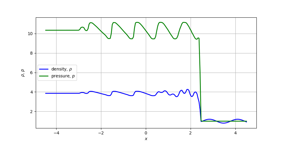
1D density and pressure profiles for the Shu-Osher shock tube problem.
Exercise: Return to finite difference approximations
We finished the NumPy section with three example codes, the first of which was An example: Numerical differentiation. Return to that example, and add plots of the exact and approximate derivatives, as well as plots for the error in the approximation. In particular, do the following:
On one plot show the exact first derivative and both approximations
Use different line styles for each line and add a legend
Plot the error on the same plot using a second y-axis
Repeat for the second derivative
Plotting the error on the same figure using a different scale requires us to dig a little deeper into how figures are created. In this case we’ll pull out the figure and axis objects explicitly and work with them. Consider the following code snippet:
# Generate plots
fig, ax = plt.subplots()
# Deriv and approximations
ax.plot(xf,ex_fFD,'-k',xf,fFD,'-b',xc,cFD,'-r')
ax.legend(('Exact','Fwd. Diff.','Ctr. Diff.'),loc='upper left')
ax.set_xlabel('x',fontsize=14)
ax.set_ylabel('Derivative',fontsize=14)
ax.set_title('Finite difference approximation',fontsize=16)
ax.grid('both')
# Create second axis for the error
# Note that we clone the x-axis instead of making a new y-axis
ax_err = ax.twinx()
ax_err.plot(xf,np.abs(fFD - ex_fFD),'--b',xc,np.abs(cFD - ex_cFD),'--r')
ax_err.set_ylabel('Absolute error')

fig.tight_layout()
plt.show()
Here we call plot directly on the axis object, instead of working through
the static interface plt.*. Most of the functions are the same, but note
the set_ prefix on the label and title functions. This approach requires a
little more set up, but allows much greater flexibility in what you can plot.
Advanced plots – 2D plots, 3D plots, subplots and more
So far we have covered some basic features for producing plots from 1D data. Let’s briefly take a look at an example which produces 2D plots of a Rayleigh-Taylor instability. This is an unstable configuration where a heavy fluid lies above a light fluid in the presence gravity. See the wiki page for more information.
To do this we’ll use this plotting script which manages all of the HDF5 file format stuff and pulls out the individual fields.
  1# Author: Ian May
  2# File: gpplot.py
  3# Purpose: Make plots and movies from solution files generated
  4#          by my GP-WENO code
  5
  6import numpy as np
  7import h5py
  8import glob
  9import matplotlib.pyplot as plt
 10import sys
 11
 12# Return hdf5 dictionary corresponding to a single file
 13def dataFromFile(fStr):
 14    print('Opening ', fStr)
 15    f = h5py.File(fStr,'r')
 16    data = {}
 17    for k in f.keys():
 18        data[k] = f[k][()]
 19    data['ext'] = tuple(data['ext'])
 20    if 'time' in data:
 21        data['time'] = data['time'][0]
 22    data['filename'] = f.filename
 23    f.close()
 24    return data
 25
 26# Return a list of hdf5 dictionaries for all file matching a glob
 27def dataFromGlob(gStr):
 28    dset = []
 29    for fStr in glob.iglob(gStr):
 30        dset.append(dataFromFile(fStr))
 31    return dset
 32
 33# Plot a single field from one dataset
 34# Optionally supply fname to override showing the plot window
 35#   saving directly to a file
 36def plotField(d,fld,nCont=0,cmap='jet',fname='',vr=[]):
 37    plt.figure(figsize=(9.6,5.4),dpi=200)
 38    if len(vr)==2:
 39        plt.imshow(d[fld],origin='lower',extent=d['ext'],interpolation='gaussian',cmap=cmap,vmin=vr[0],vmax=vr[1])
 40    else:
 41        plt.imshow(d[fld],origin='lower',extent=d['ext'],interpolation='gaussian',cmap=cmap)
 42    plt.colorbar()
 43    if nCont != 0:
 44        if len(vr)==2:
 45            plt.contour(d['x'],d['y'],d[fld],nCont,colors='black',linewidths=0.5,vmin=vr[0],vmax=vr[1])
 46        else:
 47            plt.contour(d['x'],d['y'],d[fld],nCont,colors='black',linewidths=0.5)
 48    if 'time' in d:
 49        tstr = ('Time: %1.3e' % d['time'])
 50        plt.title(tstr,loc='left')
 51    plt.tight_layout()
 52    if fname != '':
 53        plt.savefig(fname)
 54        plt.close()
 55    else:
 56        plt.show()
 57
 58# Save many plots for a given field split into frames through time
 59def saveFrames(gStr,fld):
 60    fldMin = sys.float_info.max
 61    fldMax = -sys.float_info.max
 62    for fStr in glob.iglob(gStr):
 63        d = dataFromFile(fStr)
 64        fldMin = min(np.min(d[fld]),fldMin)
 65        fldMax = max(np.max(d[fld]),fldMax)
 66    for fStr in glob.iglob(gStr):
 67        d = dataFromFile(fStr)
 68        ln = d['filename'].split('.')
 69        del ln[-1]
 70        fname = '.'.join(ln)+'_'+fld+'.png'
 71        plotField(d,fld,fname=fname,vr=[fldMin,fldMax])
 72
 73def numericError(dc,df,fld):
 74    fx = df[fld].shape[1]
 75    fy = df[fld].shape[0]
 76    cx = dc[fld].shape[1]
 77    cy = dc[fld].shape[0]
 78    dx = (dc['ext'][1]-dc['ext'][0])/cx
 79    dy = (dc['ext'][3]-dc['ext'][2])/cy
 80    rx = int(fx/cx)
 81    ry = int(fy/cy)
 82    errfld = fld+'_err'
 83    dc[errfld] = np.zeros_like(dc[fld])
 84    # Verify layouts are compatible
 85    if rx!=ry or fx%rx+fy%ry!=0:
 86        print('Invalid refinement ratio\n')
 87        dc[errfld] = np.Nan*err
 88    # Compute error by averaging fine solution
 89    for j in range(0,cx):
 90        for i in range(0,cy):
 91            dc[errfld][i,j] = dc[fld][i,j]-np.average(df[fld][rx*i:rx*i+rx,rx*j:rx*j+rx])
 92    # Summarize
 93    return (dx*dy*np.sum(np.abs(dc[errfld])),np.max(np.abs(dc[errfld])))
 94
 95# Calling convention: python3 gpplot.py <path/to/data.hdf5> <field name>
 96if __name__ == "__main__":
 97    # Open dataset
 98    print(sys.argv)
 99    d = dataFromFile(sys.argv[1])
100    if len(sys.argv)>3:
101        plotField(d,sys.argv[2],nCont=int(sys.argv[3]))
102    else:
103        plotField(d,sys.argv[2])
A contour plot of the density can be generated by calling:
python gpplot.py RayleighTaylor0128_3_002975.h5 dens
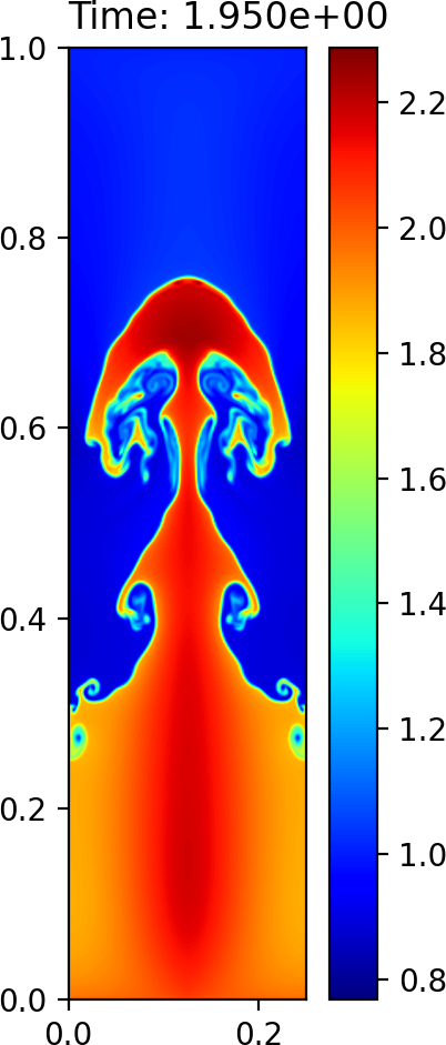
Plot of the density field at time \(T=1.95\) using imshow
Line plots of the density along a couple slices can be generated as:
import gpplot as gplt
import numpy as np
import matplotlib.pyplot as plt

# Set fontsizes
plt.rcParams.update({'axes.titlesize':16,'axes.labelsize':14,'xtick.labelsize':12,'ytick.labelsize':12})

# Import data and extract fields into dictionary
data = gplt.dataFromFile('RayleighTaylor0128_3_002975.h5')

plt.figure()

# 2 side-by-side subplots
plt.subplot(1,2,1)
plt.plot(data['dens'][:,64],data['y'],'-b',linewidth=2)
plt.xlabel(r'$\rho$')
plt.ylabel(r'$y$')
plt.title(r'Density at $y=1/8$')
plt.grid('both')

plt.subplot(1,2,2)
plt.plot(data['x'],data['dens'][300,:],'-b',linewidth=2)
plt.xlabel(r'$x$')
plt.ylabel(r'$\rho$')
plt.title(r'Density at $x=0.586$')
plt.grid('both')

# Show plot on screen
plt.show()
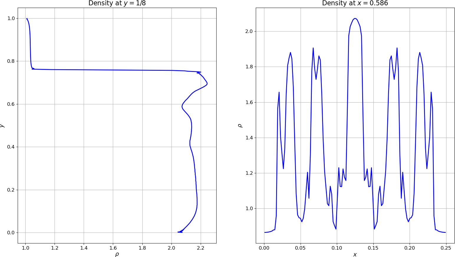
Density along slices of the flow
A surface plot of the internal energy using
plot_surface:import gpplot as gplt import numpy as np import matplotlib.pyplot as plt from matplotlib import cm # Set fontsizes plt.rcParams.update({'axes.titlesize':16,'axes.labelsize':14,'xtick.labelsize':12,'ytick.labelsize':12}) # Import data and extract fields into dictionary data = gplt.dataFromFile('RayleighTaylor0128_3_002975.h5') # Create meshgrid from individual axes X,Y = np.meshgrid(data['x'],data['y']) # Create figure and 3D axes fig, ax = plt.subplots(subplot_kw={"projection": "3d"}) ax.set_box_aspect((0.25,1,0.1)) surf = ax.plot_surface(X, Y, data['eint'], cmap=cm.CMRmap, linewidth=0, antialiased=False) fig.colorbar(surf,shrink=0.4) # Show plot on screen plt.show()
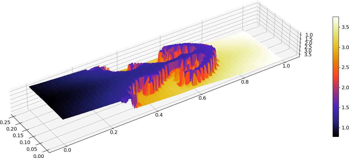
Surface plot of internal energy
A wireframe plot of the pressure using
plot_wireframe:import gpplot as gplt import numpy as np import matplotlib.pyplot as plt # Set fontsizes plt.rcParams.update({'axes.titlesize':16,'axes.labelsize':14,'xtick.labelsize':12,'ytick.labelsize':12}) # Import data and extract fields into dictionary data = gplt.dataFromFile('RayleighTaylor0128_3_002975.h5') # Create meshgrid from individual axes X,Y = np.meshgrid(data['x'],data['y']) # Create figure and 3D axes fig, ax = plt.subplots(subplot_kw={"projection": "3d"}) ax.set_box_aspect((0.25,1,0.3)) ax.plot_wireframe(X, Y, data['pres'], rstride=4, cstride=4) # Show plot on screen plt.show()
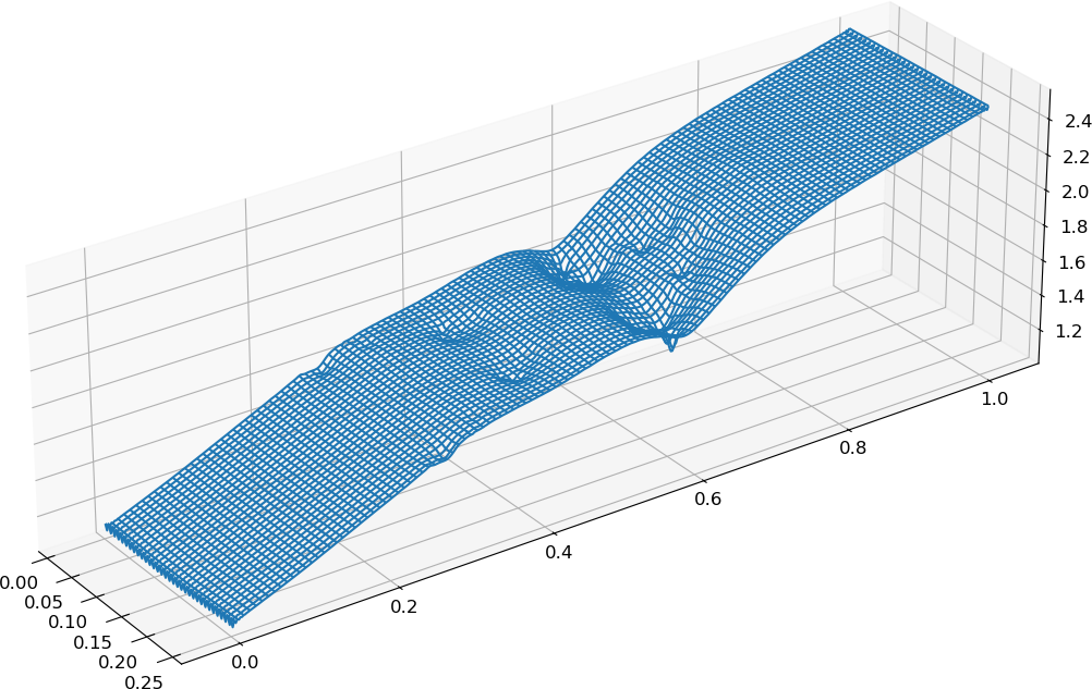
Wireframe plot of the pressure
One can also produce a plot with multiple subplots:
 1"""
 2
 3/lectureNote/chapters/chapt05/codes/plot_flash_subplot.py
 4
 5An example Python subplotting code using a FLASH 2d data
 6-- Sedov explosion on a uniform grid of size 256 x 256
 7
 8
 9See more examples and options at:
10
11  http://matplotlib.org/gallery.html
12  http://matplotlib.org/users/image_tutorial.html
13
14Written by Prof. Dongwook Lee, for AMS 209, Fall.
15
16"""
17
18
19import h5py
20import numpy as np
21import os
22import sys
23import matplotlib.pyplot as plt
24from mpl_toolkits.mplot3d import Axes3D
25
26
27# =======================================
28# 2D subplots
29
30maxDens = -1.0
31minDens = 1.e10
32for i in range(1,7,1):
33    fileName = 'sedov_hdf5_chk_000'+str(i)
34    file = h5py.File(fileName, 'r')
35    var  = file['dens']
36
37    if var[0,0,:,:].max() > maxDens:
38        maxDens = var[0,0,:,:].max()
39
40    if var[0,0,:,:].min() < minDens:
41        minDens = var[0,0,:,:].min()
42
43
44fig,axes = plt.subplots(nrows=3,ncols=2)
45print (fig,axes)
46
47for i in range(1,7,1):
48    print (i)
49    fileName = 'sedov_hdf5_chk_000'+str(i)
50    print (fileName)
51    file = h5py.File(fileName, 'r')
52    var  = file['dens']
53    #plot_flash_2d_imshow(file)
54    plt.subplot(3,2,i)
55    plt.imshow(var[0,0,:,:],extent=[0,1,0,1],vmin=minDens,vmax=maxDens)
56    plt.xlabel('$x$')
57    plt.ylabel('$y$')
58    #plt.title('2d plot of density')
59    plt.colorbar()
60
61
62
63
64# =======================================
65# Show plots to screen
66plt.show()
67
68# close file
69file.close()
Note
Notice in the above example that there are two for-loops, where the first
loop finds the global min and max of the time varying densities over a series of
times, \(t=0.01, 0.02, 0.03, 0.04, 0.05, 0.06\). The second loop uses the
obtained minimum (\(\rho_{\min}\)) and maximum (\(\rho_{\max}\)) densities
in order to plot six subfigures in a consistent color scheme. Otherwise, all six
subfigures would use different color scales, making it hard to compare the density
values over time.
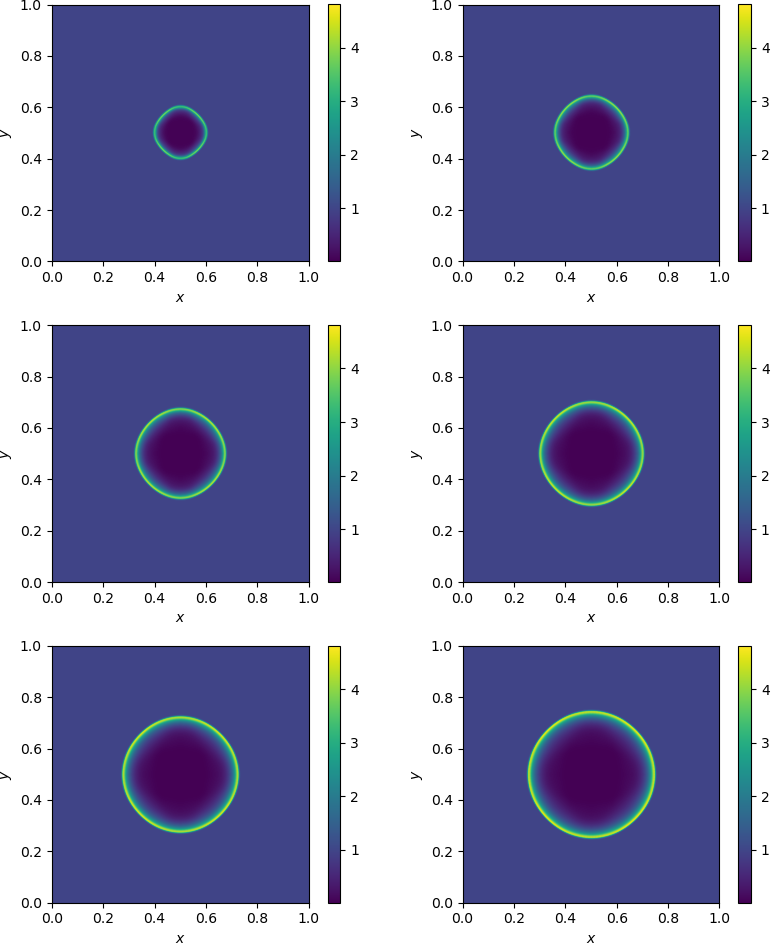
2D subplots of density at various times.
There is plenty more to learn, and many great examples can be found on the Matplotlib gallery page. If you have a mental image of a figure you want to create, have a look there first for anything that may be similar.